Graphs
Modes:
Top 10 Origins:
Journey to Work Data Visualization
* This circular plot shows the linear commute distance and the corresponding number of commuters for each origin/destination

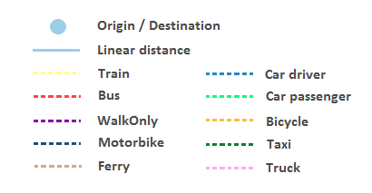
Label indicators:
Map
* This map shows the actual route between a given origin and destination.
Linear distance: Under construction
Real distance: Under construction
Acknowledgment:
This work has been informed by the JTW Visualiser developed for the NSW Bureau of Transport Statistics http://visual.bts.nsw.gov.au/jtwdynamic/. The key differences are that this interface enables users to explore JTW data from 2001, 2006 and 2011 (not just 2011) and from SEQ and Melbourne (in addition to Sydney). Moreover, the JTW data plus a set of derived population mobility indicators can be dynamically generated and visualised on bar graphs, circular plots and a map interface.
© UQ eResearch Group